After reading this article helped me to think the way of design. One thing that I considered is, how about disability people? It would be great if I can design for normal and disability people.
a well-designed interaction and a poorly-designed
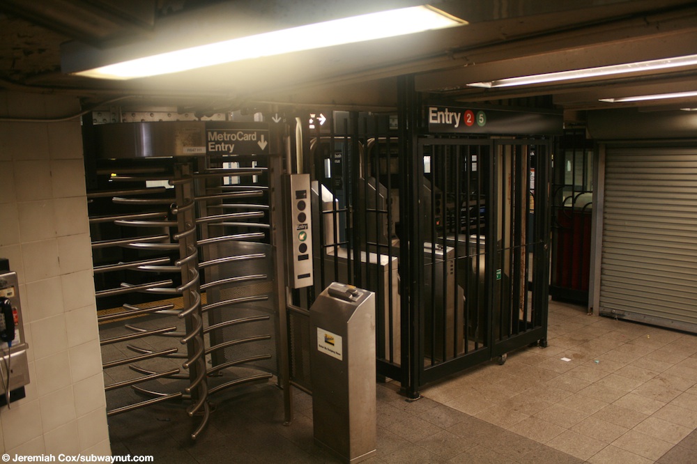
MTA turnstile
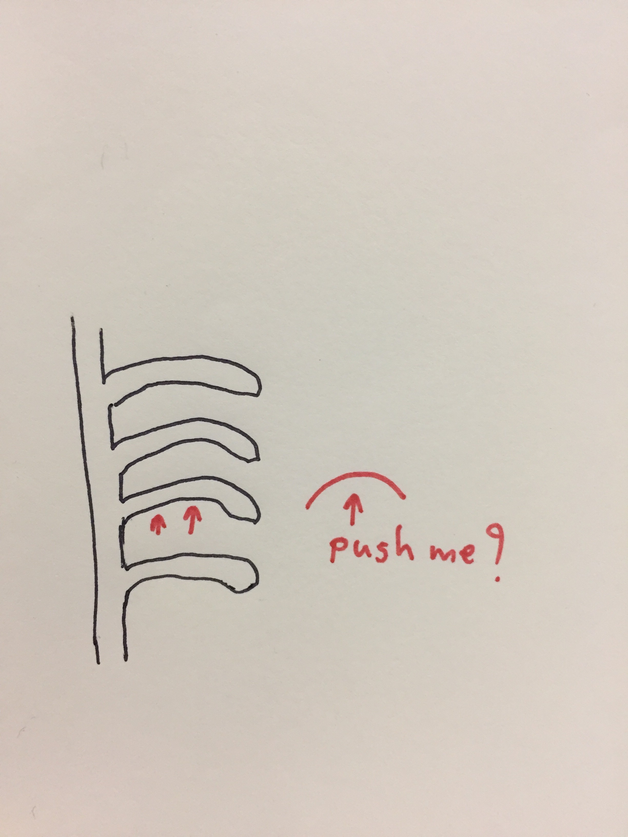
I don’t want to say this is the best turnstile in the world but I think I like this one the most easiest for me. It’s easy for me to understand if I can get in or not. the weight is not that heavy. I don’t need to be rush after I swipe the card and if I have a huge bag, I can pass it by simple human reaction when you want to go further, just “push”. compare to the other one.
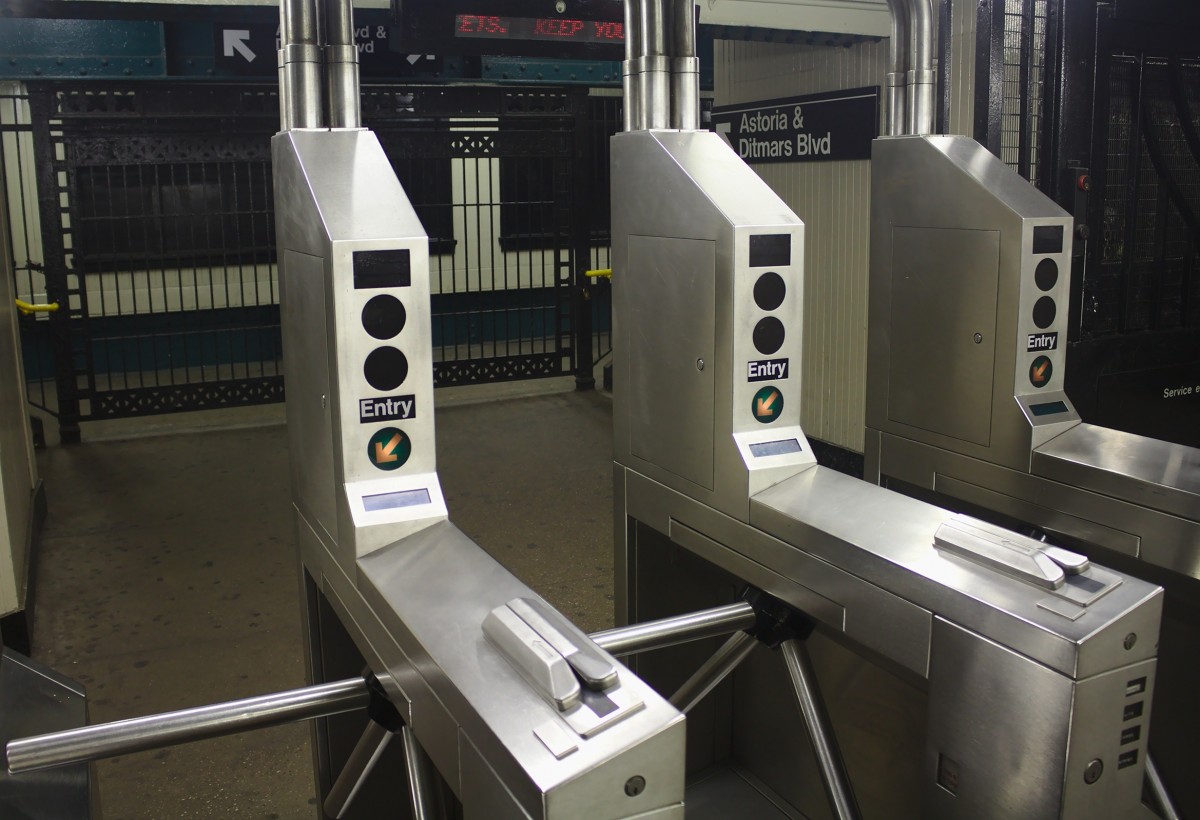
This one made me very confused at the first time when I use it. I’m not sure which way I have to push. I can bring a big bag with me and the turnstile is very heavy. I almost got hit by this turnstile when I run close to a person in front of me. The only thing that told you which way is the right way is the curve of the turnstile
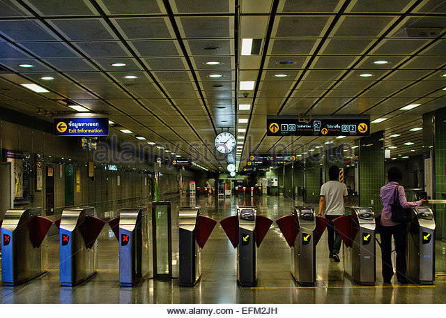
I guess they design this turnstile to prevent people to jump in for free and don’t paid.
This one is the entrance of Bangkok’s train. It always hit me badly. I don’t understand until today why they need to program them like that. If you want to jump they can anyway. Mostly they hit normal people who use them everyday.